Our trailer incorporates many of the regular conventions associated with the Action-Comedy genre. After watching a range of Action-comedies, we noted all the recurring shot types and compositions and tried to encompass them in our trailer, however, the main observation was that the majority of transitions were simple jump cuts and the shots ranged mainly from long to mid to close ups. They are also sequenced in chronological order; on the whole, so that the audience can get an idea of the film’s plot, we chose to follow this particular convention for the reason that our piece would be hard to understand if sequenced haphazardly. We also felt that, when watching the finished article through, the scene transitions were plain and added nothing to the comedy aspect of the trailer, therefore we decided to add some dissolving and sliding transitions.
Another technique learnt was the ability to freeze a shot and add text to it. This gave us the chance to introduce characters in the manner that action comedies do. The use of sound effects was limited, with the exception of pure action points; however, our trailer focused more on the comedy aspect than the action so we decided to stay with purely music. We noted that the music was always quite jovial with moments of high impact and slower parts. Going on this framework, we searched for the perfect song, with great difficulty we found one, which fit with the “hillbilly” theme we were going for. We applied it to our trailer and it climaxed at the right moments to give high impact. The connotations of both the music and the brightly coloured mise-en-scene for the characters show that the film is light-hearted and comical, as yellow is a symbolic reference to happiness.
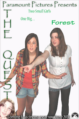
The characters in the trailer are stereotypical Tennessean youth, ones that connote a “dumb” happy go lucky American often referred to as a Hillbilly. That being said, our representation adds a new dimension to the typically negative stereotype by making them more three dimensional, making them something that the audience can relate to – tourists. To make this more evident in the short amount of time of a trailer we used iconic references, such as the mise-en-scene, in particular the costume, to help highlight their origin to the audience. Due to research done into the most receptive action-comedies, such as Pirates of the Caribbean and Without a Paddle, we decided that to aim our trailer at young teenagers, as they are predominantly youth watched films. Also when researching distributors of such films we noted that Paramount Pictures were a prime distributor of action-comedies, therefore would be the institution most likely to produce our trailer. Our certification would be a 12 as many previous action-comedies have been and our trailer has no obscenities, swearing or sexual references therefore would not offend a younger audience. With that in mind our promotional campaign would be heavily based upon technological outputs that are popular with the new media obsessed youth. The first outlet would be the television, with an advertisement in between programmes such as Coronation Street or a number of reality TV shows, which have a wide teenage audience. Secondly, we would advertise on the internet, where surveys have shown many youths communicate, the development of sites such as facebook, MySpace and MSN have led to a media-communicative youth so would be a good space to advertise in. Thirdly would be the radio, in particular Radio 1 – a vast station that is heavily involved in the global village. This encompasses the internet also, with the Radio 1 website that gives lists of the shows film reviews and is a popular site among the youth of today. Furthermore, we would use the conventional methods of advertisement, such as posters and magazine inserts that would be noticeable to teenagers, for instance placing a poster in a bus stop near a school or college where many youths catch the bus to their educational institutions – perhaps even on the bus itself.
From this project I have explored the different technologies available to film makers, the use of tracks to capture moving images and the use of helicopters to shoot high altitude action. We also discovered a site that taught us how to produce film effects, such as bug inside somebody’s flesh, however we had no use for any of these effects in our trailer. One piece of equipment we used, which is used by professional film companies, was a boom mic. This enabled us to pick up sound from far away that we would not normally have picked up. We also used the conventional camera and tripod so we had a range of handheld and steady cam shots, we also used an MP3 recorder which we familiarised last year. The Adobe Package was the same as the one we used the previous year, but was much easier to use this year, knowing how to operate it. This helped when it came down to editing clips and adding multiple soundtracks that we needed to fade in and out. It also helped us to incorporate a wider range of transitions that developed our knowledge of the package further.
The Extreme close up was not something I had used before, as was the slow zoom out that followed. This allowed me to expand my shot capabilities and also added that sense of mystery our piece needed.
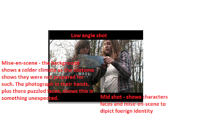 On previous tasks, we had attempted to use low angle shots, but they never really worked. Incorporating it here I felt worked well as it helped show the ‘bigger than life’ characters against a background that is completely foreign to them, as depicted by their facial expressions.
Furthermore, the necessary auxiliary tasks meant that we had to explore and master Adobe Photoshop 3.0. We created a film poster for our film, with connotative signs that fit with the action-comedy conventions, such as colourful text and plain backgrounds, with the protagonists in the foreground. We also had to design an Empire magazine cover, following the normal design that Empire use, this meant the use of puffs and flashes. The cover I designed and created used many bright colours and a fun photo that helped capture the characters personalities so that the connotations were that of happiness and humour.


We also did a survey on our target audience, asking them to first watch our trailer and then fill out a questionnaire which found that the genre was clear to most as was the plot and protagonists.
Over the two year course I have developed my knowledge of the media industry, the use of technology and distribution, and I have also familiarised myself with the technology available to me. I also feel I have progressed my maturity with technology and become more adapt at navigating Adobe Premiere. Furthermore, I have become adapt at using Photoshop, both Photochop CS at home and Photoshop 3.0 at sixth form.

